Click here to subscribe to our mailing list to receive 10% off your next shop purchase 

I’ve been very lucky to have had the opportunity to do some extensive tattoos for Kris already. He is an amazing client to work with and when he approached me about a Japanese Kitsune Tattoo I was obviously excited. It’s great to work with someone who has an appreciation for the body as a whole. A client who has the commitment to stay with one artist to realize the vision for a bodysuit is greatly appreciated and its a joy to see it come together. Kris has the right balance of wonderful ideas, open mindedness to the development of the design and very regular sessions, which means his pieces are completed very quickly.
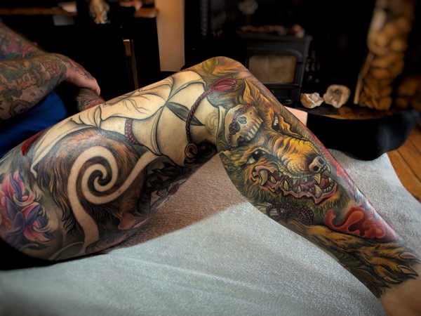
We previously finished his Phoenix front and Fu Dog backpiece in less than a year. Now we have completed his Japanese Kitsune tattoo as a full leg sleeve. Although we are working on a bodysuit, we have sectioned his body up to complete section by section, planning tie-ins and flows from one body part to another to make the bodysuit seamless. This is an essential part of planning a tattoo for me. Not everyone comes to me wanting a bodysuit like Kris, but many people progress to that over years. I want every tattoo to be extendable seamlessly into a bodysuit. That takes thought and consideration, so as not to make a blunt end or area that won’t flow well if extended.


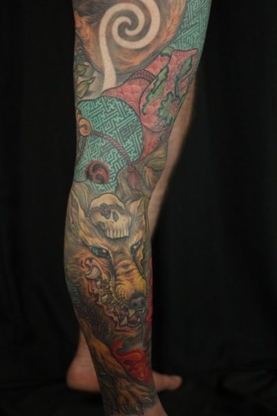
I am very excited to share with you the finished project. Kris’s Japanese Kitsune leg sleeve with colourful geometric robes. A crazy technical endeavour that I’m sure you will agree, was worth the work and eye strain!!!

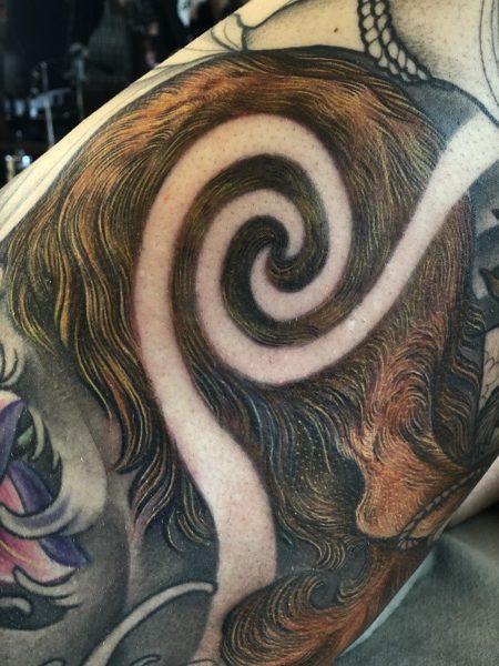
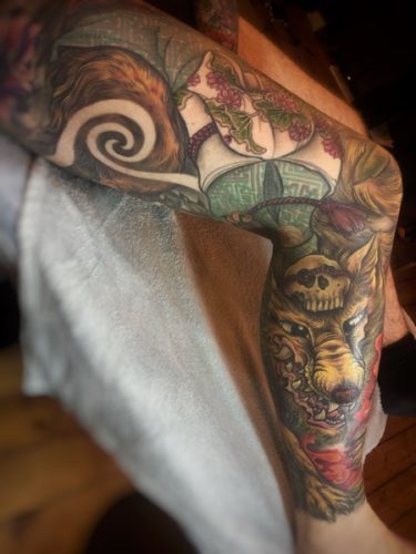
A Kitsune is a Japanese nine-tailed fox. They are mythical creatures, steeped in many legends. They are one of my favourite Japanese characters. Through tricks and magic they are said to expose flaws in humans and are able to transform into anything. To do so they need reeds, a broadleaf and a skull on their head. They are mischievous, they assist in harvests and when shown compassion they return it tenfold.


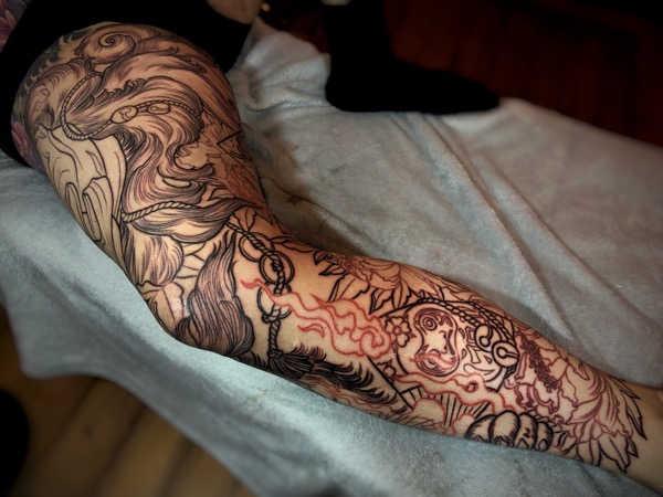
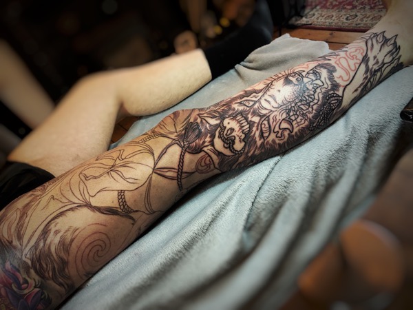
I freehanded Kris’s Kitsune with the use of foxes as photo reference, I used yellow pens first, then as I become more sure of the design I move to orange, red then finally a fine blue pen. Working from the foreground of the design and the main focal points, taking into consideration the flow of the piece through leaves, robes and fur.


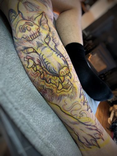
The first few sessions were completing all the linework throughout the design. I start with a medium-sized 7 liner, then I sculpt the lines with an 11-liner and finally add smaller details such as fur with a 3-liner. This method of lining allows me to make certain areas the focal points whilst allowing other areas to drop into the background. Approaching it in this way creates depth even before any shading or colour is added and forms a ‘journey for the eye’ throughout the piece. This brings attention to areas we want to hold the viewer such as the Kitsune face, a fan or flower.


Once the lining is completed, they grey shading begins. I leave areas for bright colour but the aim of the grey shading is to create more depth and flow throughout the piece. I do this by having some areas darker than others and using shadows of other leaves that give the illusion of more going on than your eye can clearly see. Like a camera where the background is slightly out of focus or blurred, drawing your eye back into the main focal points again.


Once all the grey is in I start working through the colours, I normally start with the green leaves. Then the flowers and finally finishing on whatever will be the focal point. This method of working through in this order works with the natural ageing process as the tattoo heals and softens. Allowing the focal points to be the newest and freshest part of the tattoo. This matters less if a tattoo is done in a relatively quick space of time. It is more essential if there are large gaps between sessions. Sometimes those large gaps are not planned from the start but then something out of everyone’s control can happen so I stick to this process as closely as possible.


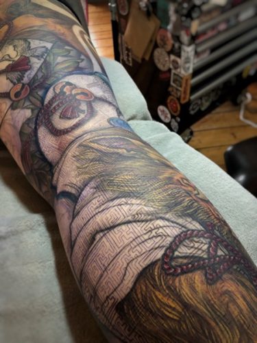
As we got to colouring the robes I created a stencil from fabric we purchased on one of our trips to Japan. The stencil was laid over the tattooed fabric and lined with a 3-liner in grey. The grey lines create a crisp edge to the colour but is not visible once the colour is added. This was a difficult process and there was a lot of cross-checking to make sure it was correct. The stencil was applied twice before it was agreed that we had it right. Both Kris and I love the result.


Colour choices are really important to me. Firstly I like to know if the client wants soft muted colours or really bright. Any areas they are sure they want to be certain colours then we can work around that. Kris and I put a lot of thought into the colour choices on this piece. Especially the robes. We used original Kimono print books I bought from japan to keep it as authentic as possible
.
I love to create a design with a good balance between hot and cold colours. So throughout the colour planning I try to do this in balance through the whole design. When I studied for my degree we were taught about using ‘complementary’ colours. These are colours opposite each other on the colour wheel and ‘triadic’ colours. Three colours spaced equally apart on the colour wheel and I use this a lot when selecting colour palettes.


Towards the end of the tattoo, I may revisit certain areas. I find that adding another layer of dark or a few more highlights can bring extra depth and detail to the design. For not a lot of additional work, you get a piece that can be bought to life by a few details.


A huge thank you to Kris for coming back and staying committed to the completion of his bodysuit. I really appreciate your continued dedication. It was a pleasure to create your Japanese Kitsune Tattoo.

If you are interested in finding out more about Japanese mythology I would like to recommend this book, JBxH3 Japanese Buddhism x Horiyoshi III. Although Google can be a great source of reference, I do find a book to be a much better resource.
If you are interested in being tattooed by me please check out my FAQ.
Thank you x